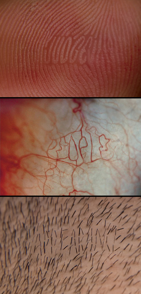
An insane user-submitted addition to Sagmeister's "Thing's I Have Learned In My Life So Far" project. "Don't Judge People By Their Appearances" is an organic typography project by designer Peter Chmela; head on to Sagmeister's site for the rest of the set... Also, am I the only one who finds that hair follicle image a little unsettling?
Via SwissMiss.
DON'T JUDGE PEOPLE BY THEIR APPEARANCES
Posted at
at
7:50 PM
on
Friday, April 24, 2009
by
Posted by
Matthew
|
1 comments
|
Filed under:
design,
sagmeister,
typography
GOOGLE MAPS ALPHABET

Over the course of several months beginning October 2008 to April 2009 designer Rhett Dashwood has been spending his spare time searching Google Maps hoping to discover land formations or buildings resembling letter forms. This is what he came up with.
Via SwissMiss
Posted at
at
10:12 PM
on
Tuesday, April 21, 2009
by
Posted by
Matthew
|
1 comments
|
Filed under:
interesting,
typography,
web
THE HAZARDS OF LOVE
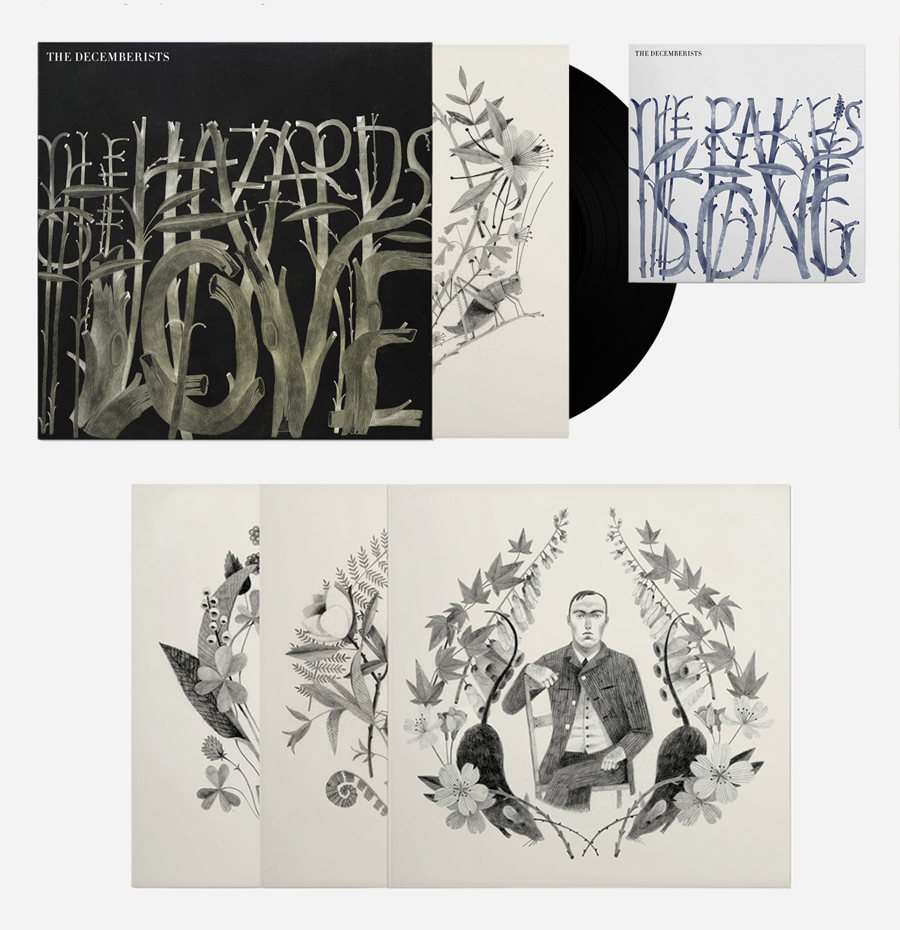
Designer Mario Hugo (Hugo & Marie), known for his shape-shifting approach to design and typography, recently worked with illustrator Carson Ellis on this gorgeous album & vinyl sleeve for The Decemberists' latest release.
Mediocre album or not, this will be one of the few album purchases I make based solely on the packaging.
Posted at
at
1:19 AM
on
Sunday, March 29, 2009
by
Posted by
Matthew
|
0
comments
|
Filed under:
album covers,
design,
music,
typography
SAGMEISTER FOR LEVIS 501
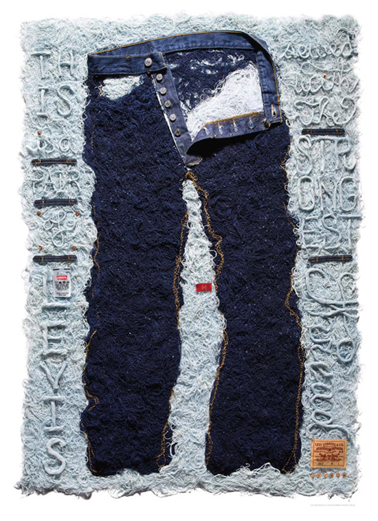
After working with art-world luminaries Damien Hirst and Shepard Fairey, Levis turned to star graphic designer Stefan Sagmeister for their latest art-based collaboration. The result is this quirky window installation that debuted at L.A. retailer American Rag. Being a Sagmeister fan myself, it's great to see his unique brand of typography being put to good use here. Cheers to the Levis team for bringing us another tasteful collaboration.
Via Design Taxi.
Posted at
at
10:12 PM
on
Saturday, March 21, 2009
by
Posted by
Matthew
|
0
comments
|
Filed under:
advertising,
design,
fashion,
levis,
typography
THE PERIODIC TABLE OF TYPEFACES
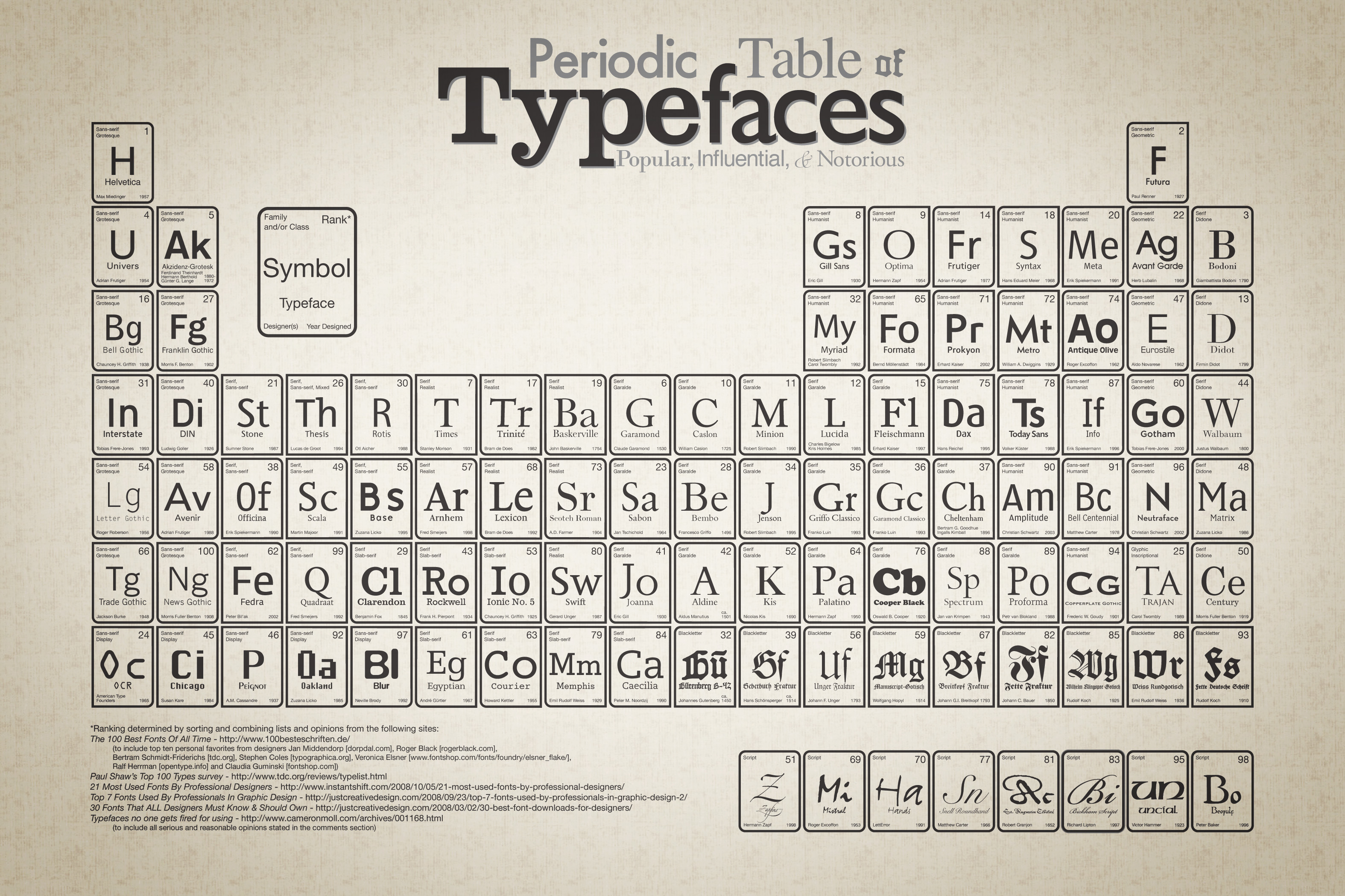
The Periodic Table of Typefaces is a cleverly designed list of the 100 most popular, influential and notorious typefaces today. I'm just curious as to how Comic Sans didn't make it onto the table, after all it is notorious for being the shittiest typeface available, that has to count for something.
For the high res version, click on the image above. Via Swissmiss.
Posted at
at
10:42 PM
on
Wednesday, March 11, 2009
by
Posted by
Matthew
|
0
comments
|
Filed under:
design,
typography
ANIMALPHABET
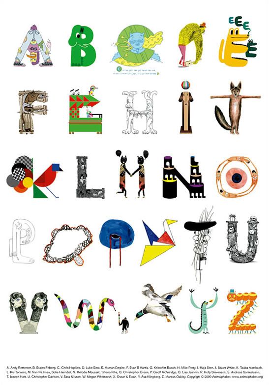
Innovative typography paired with dope illustrations, what more could you ask for? Next week, Andreas Samuelsson and Jan Kruse will be releasing this new poster titled Animalphabet. The poster features a number of established artists illustrating their take on an alphabet comprised entirely of animals. Animalphabet comes in a limited run of 500 prints and will be available at A Number of Small Things.
Via Kitsune Noir.
Posted at
at
11:18 PM
on
Wednesday, February 25, 2009
by
Posted by
Matthew
|
1 comments
|
Filed under:
design,
illustration,
posters,
typography
Subscribe to:
Posts (Atom)