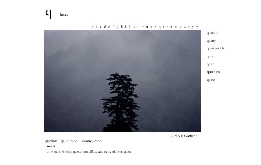
The Photographic Dictionary is dedicated to defining words through the literal, figurative and personal meanings found in each user-submitted photograph. The project was founded by Netherlands-based photographer, Lindley Warren.
Via SwissMiss.
THE PHOTOGRAPHIC DICTIONARY
I'VE GOT MY EYE ON YOU
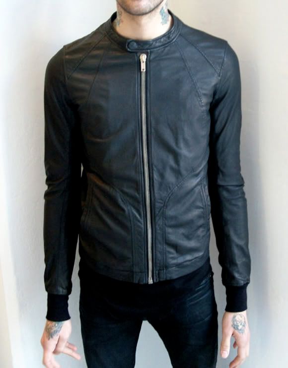
The Rick Owens lambskin intarsia jacket. What do you guys think? Is this the leather jacket to invest in, or am I just trippin?
KILLZONE 2 MAIN TITLES
Guerrilla commissioned Dutch motion designer Joost Korngold aka "Renascent" to design the main titles sequence for PS3's upcoming Killzone 2. The result is probably the finest looking credits sequence ever seen in a video game (not that there were many to begin with but I digress). Hell, if someone were to tell me this was a Prologue piece, I'd have believed them. So if you're as much of a gamer as you are a fiend for good design (like yours truly) then check this out.
Via Motionographer.
THE ADI LOOKBOOK
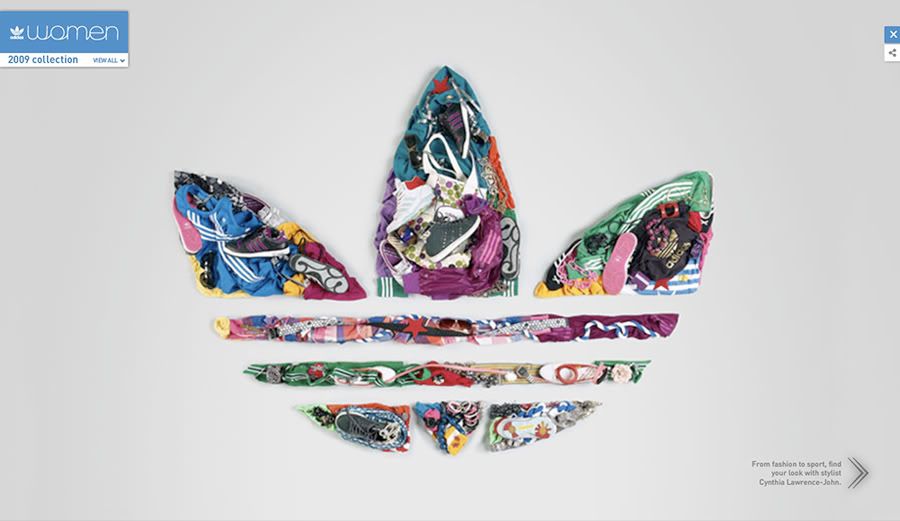
Adidas recently launched the Adi Lookbook, a promotional mini-site showcasing products from the Adidas Originals women's line. The site features some fantastic use of stop-motion (also put to great use in last year's Adi Dassler spot) with fashion photography and top notch art direction by Rodrigo Braga of Montreal's Sid Lee. Oh yeah, and while you're at it, be sure to check out the lookbook for Jeremy Scott's latest Originals collaboration... what can I say? Adidas killed it yet again.
Via Adverblog.
ANIMALPHABET
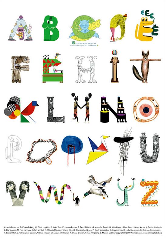
Innovative typography paired with dope illustrations, what more could you ask for? Next week, Andreas Samuelsson and Jan Kruse will be releasing this new poster titled Animalphabet. The poster features a number of established artists illustrating their take on an alphabet comprised entirely of animals. Animalphabet comes in a limited run of 500 prints and will be available at A Number of Small Things.
Via Kitsune Noir.
THE CRISIS OF CREDIT VISUALIZED
The latest entry in the realm of educational motion design, "The Crisis of Credit" is an ambitious project by Jonathan Jarvis that tackles the complex and often controversial origins of today's failing economy. As expected, there have been a number of criticisms questioning the short's accuracy, but regardless of these no one can deny that Jonathan's visual essay is informative, engaging and effective.
The animation was completed as part of Jonathan's thesis for the Media Design Program at Art Center College of Design.
Via Motionographer.
SUPREME S/S 2009
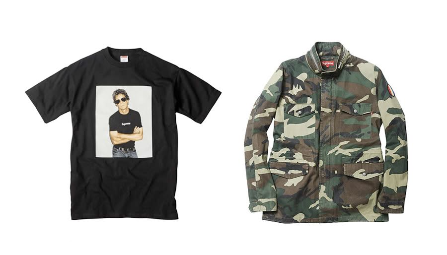
Business as usual for the upcoming Supreme drop… same shit, different collection. The Lou Reed tee is pretty dope and so is the camo M-65 (both pictured above), but even then it’s nothing worth getting excited over. I’m not sure if its still Brendan Babenzien doing his thing there but whoever it is, the guy really needs to elevate his game. Supreme has been pretty stale over the past few seasons and it doesn't look like it's getting any better.
So in the meantime, you’re better off looking towards up-and-comers like Wings + Horns to satisfy your Summer street wear needs.
HEDI SLIMANE PHOTOGRAPHS LINDSAY LOHAN

Hedi Slimane and... Lindsay Lohan? Firecrotch (sorry I couldn't resist) is the latest celebrity to be featured on Hedi's Fashion Diary. This is probably one of his stranger choices in subject, but then again he does have a knack at photographing train wrecks. Courtney Love or Amy Winehouse anyone?
That being said, I am quite fond of these photos, though I suspect this has more to do with Hedi than it does with Lohan. Check out the rest of the set here.
CREDIT WHERE CREDITS ARE DUE

In a New York Times op-ed piece, designers Emily Oberman and Bonnie Siegler argue that the Oscars should have a category for the design of title sequences.
Titles have always played a significant part in motion pictures. They may have started out as simple black-and-white cards. But in the days before sound, they already did more than identify key players: they communicated dialogue and advanced plot. And as filmmaking evolved, so did title design. Titles have become wonderful bridges from reality into the cinematic world and back out again. At their very best, they are themselves innovative, emotional experiences, microcosms of their movies.
Their list of notable nominees (if such a category were to exist) include names as Saul Bass (though he'd probably be a better fit for Lifetime Achievement), Kyle Cooper, Pablo Farro and other contemporaries as the Prologue Films crew and this year's would-be winner, Pixar. Check it.
Via Kottke.
FIVE ARTISTS. THEIR DREAMS. ONE CITY.
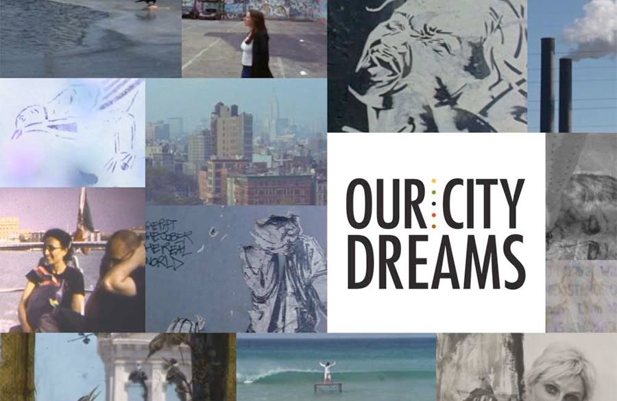
This beautiful film by Chiara Clemente was recently screened at the New York Film Forum. In Our City Dreams, Clemente documents the inspirational journey of five women from different generations who have migrated to New York in hopes of fulfilling their dreams as artists. The documentary features Kiki Smith, Swoon, Ghada Amer, Marina Abramovi and Nancy Spero as its five subjects.
“The idea for the film began to form on my return to New York. I had left New York with the eyes of an adolescent and returned with the eyes of an adult - it is a place so familiar yet so mysterious and exciting... This film is inspired by those who have been lured to New York and have stayed for the ride. I respect especially those determined women who have fought their battles and found their voice in a stubborn town. Some of the most significant artists working in New York today are women. It is time that we discover some of these brilliant artists not only through their work, but through an intimate glimpse into their worlds.”
View the trailer here.
EXTREMELY REALISTIC SOUND
Here's a clever new ad from the German electronics manufacturer Leowe. These days, it's nice to see an advert that doesn't (fully) rely on post-production to get its message across, but lets its concept do the talking. Check it.
Via Swissmiss
INGLORIOUS BASTARDS
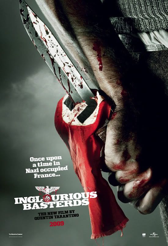
Harry over at AICN recently gave his readers a glimpse at three new posters for the highly anticipated Tarantino flick Inglorious Bastards. I'll admit, the posters are pretty bad-ass (the one pictured above in particular) but I wish the designers were a little less tame with the imagery and came up with something more brutal to match the film's tone... whatever.
View the rest of them here.
RIP NUMBER (N)INE

It was announced today by Hint Magazine that the Japanese label Number (N)ine will be closing up shop. This comes as shocking news, especially after Miyashita's recent F/W 09' showing which was very well received by the fashion community. No real reason was given, asides from the rather ambiguous statement "when you’re finished changing, you’re finished." Whether this has anything to do with flaky investors (à la Obedient Sons) is yet to be known, either way, the line will surely be missed.
Number (N)ine was first established in 1996 along with KOOKS Ltd. by designer Takahiro Miyashita (1973). His debut collection was an instant hit with the Japanese public and within a year, Miyashita opened his first flagship store in Omotesando, Tokyo. It didn't take long for Miyashita to gain international acclaim with his de-constructionist, punk rock aesthetics and in 2003, the label opened it's first overseas boutique in New York. The following years saw Number (N)ine become a major contender on the runways of both Paris and Tokyo.
Via Hypebeast
INVITATIONS ONLY
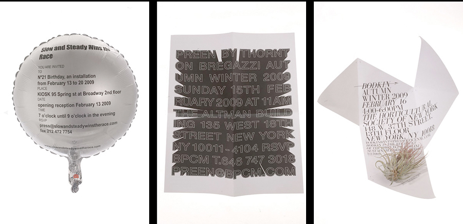
New York Times' The Moment recently posted up a number of slick looking invitationals from last week's New York Fashion Week. Although all of them looked dope, these were my favorite ones... Slow and Steady Wins the Race, Preen and Bodkin.
Compiled from The Moment.
HOUSE OF CARDS
Shelter, the British housing and homelessness charity, collaborated with the Leo Burnett Group in launching a new campaign to highlight the depth of Britain’s current housing crisis. This mesmerizing spot features the music of Radiohead and is narrated by actress Samantha Morton. Directed by Dom and Nic with some amazing post-production work by Framestore. Check it.
Via Osocio
THE QUEST FOR G

Garnett, Kareem, Jordan, Jeter and The Jabbawockeez spoofing Monty Python's Quest for The Holy Grail; how dope is that? I ignored this at first thinking it was a continuation of Lil' Wayne's "What's G" campaign (I thought those were annoying as hell, mostly due to Wayne's ridiculous voice) but damn was I mistaken.
This thing is loaded with cameos: Garnett the Glorious (Kevin Garnett), Jeter the Gifted (Derek Jeter), Jimmie the other Gifted (Jimmie Johnson), Sir Bolt the Gutsy (Usain Bolt), Sir Bolt's pet “Ego”, Misty & Keri the 3 legged and 2 headed knight (Misty May & Keri Walsh), Alicia the girl that made horse trotting noises (Alicia Sacramone)... Also, bonus points goes to anyone who can spot Michael Jordan's brief appearance.
You've got to give credit to TBWA and Buck for not fucking this thing up (which could have easily happened), instead they've managed to capture the tone and charm of the original perfectly. Check it.
TEXTURE
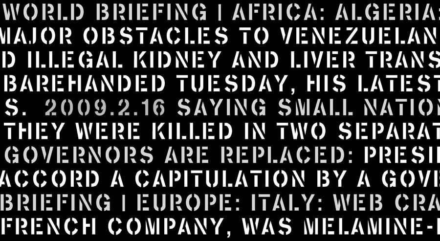
A slick new screensaver by frequent collaborators Sato Kashiwa and yugop "tha ltd." and another great example of data visualization and infographics done proper.
“Texture” is a screensaver that visualizes waves of the day’s news in various typefaces created by Kashiwa Sato / Samurai. The screensaver can also display fonts installed in your computer to act as a random font sampler. Download it here.
WORDS BY YOU

This sounds like a good time.
For the next year or so, Craig Frazier will post a new drawing every week in desperate need of a caption. Craig invites you to write the words that you think belong to that drawing. Please submit a line no more than 30 words in length by that friday 5pm. Every week’s submission will be judged by an editorial review board of one and the winner will be posted the following week and remain forever in the book. As a reward you will receive credit, including your website, if you wish, and a copy of DraWords when it is finished.
Via Swissmiss
THE LA EARTHQUAKE SOURCEBOOK
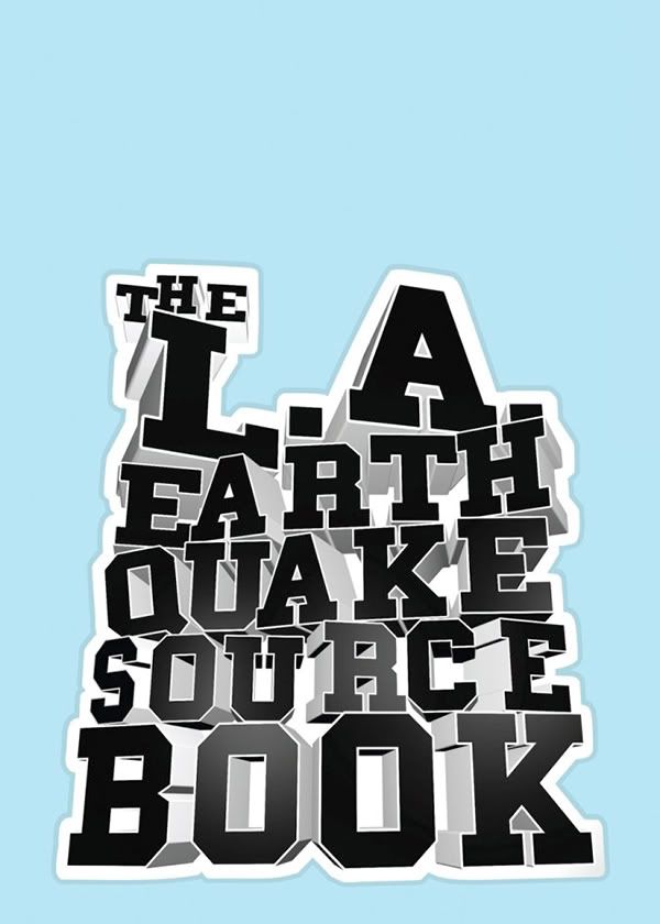
Just picked this up the other day. The L.A. Earthquake Sourcebook is an earthquake preparedness guide designed by Stefan Sagmeister with L.A.'s own Art Center College of Design.
Granted this thing is pretty useless if you aren't living in a high earthquake-risk zone (and even then its effectiveness has been questioned by critics), the collection of Sagmeister's clever, tongue-in-cheek visuals makes it well worth the price or at the very least a thorough flip-through. Now let's all hope that Sagmeister's next project is a visual interpretation of Max Brook's Zombie Survival Guide.
OPENING CEREMONY WEBSITE LAUNCHED
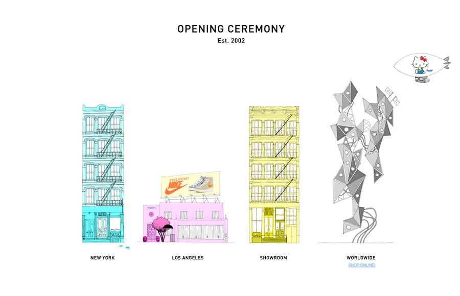
The L.A. retailer Opening Ceremony has finally updated its website, and by updated I mean it has actual content now. The lo-fi aesthetic doesn't offer much to look at but the on-line store does, so be sure to check it out. That being said, if you're like me and you only really care for Opening Ceremony's own footwear line, then I suggest you pay a visit to their eLuxury account first.
Via High Snobiety
OCTOBER DANE - CONCERT À EMPORTER
"More than anything, I want life to sound, be, and look this beautiful all the time."
Word.
LOVE ISSUE ONE
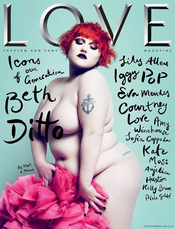
The first issue of LOVE, Condé Nast's new bi-annual magazine, will be in stores on February 19th. LOVE is edited by Katie Grand (former editor of POP) and will take a markedly avant-garde approach to reporting the latest in luxury fashion and the arts. Though there has been much speculation as to whether or not this kind of magazine will survive during these trying times, the cover makes it clear that LOVE won't be lacking in solid art direction or content.
ANN DEMEULEMEESTER BEADED BUG BROOCH
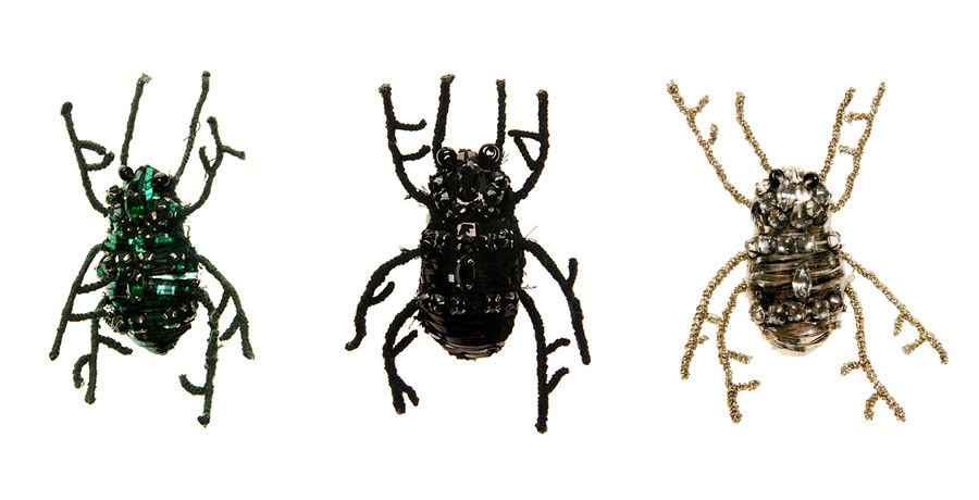
Definitely one of this season's freshest. The Ann Demeulemeester beaded bug brooch comes in green, black and silver and is made of a crystal and wire mesh. Now available at Browns Fashion and Aloha Rag.
THE BIG PICTURE: GREAT PRAYER FESTIVAL

Lamas and Tibetan Buddhist pilgrims participating in the Buddha Thangka unfolding ceremony at the Wutun Shang Tibetan Buddhist monastery on January 30, 2009 in Tongren County of Qinghai Province, China.
The Big Picture has compiled some stunning photographs of the event. Check it.
NEW YORK'S GREATEST
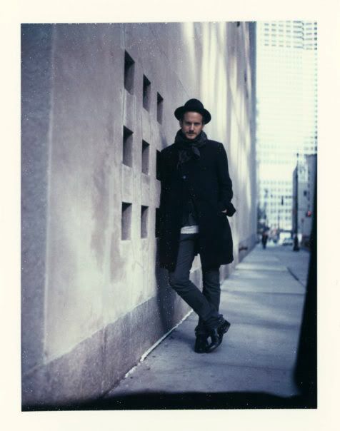
A big congrats to Pete and the rest of the Robert Geller crew for their well-earned win. It wasn’t much of a surprise really, considering the better half of Cloak is going up against joke designers like this. Anyway, Geller is one of the few NY designers that hasn’t been completely dickriding that Thom Browne / Old-Americana look that’s oh-so-hip today and it's refreshing.
Also, peep his latest F/W 2009 collection here.
THE GRAMMY'S
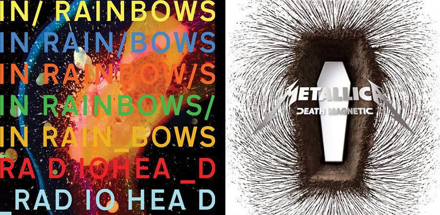
Fontfeed recently posted their review of this year's Grammy nominees for the only categories that really matter, Best Packaging and Best Music Video. Personally I didn't care much for the Death Magnetic artwork that won Metallica the Best Packaging award, but I did think In Rainbows for Best Special Limited Edition Package was an inspired choice.
Also, be sure to check out all of the nominees for best short-form music video. Check it.
VISVIM IN CUBA
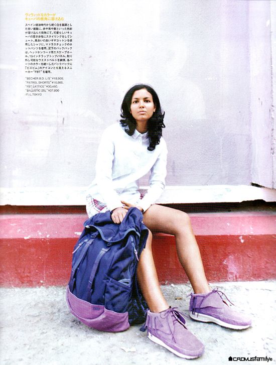
In collaboration with Japan's Sense Magazine, Visvim showcases their upcoming spring/summer collection on the streets of Cuba. This is an interesting direction for Hiroki and his crew and I'm definitely feeling the new looks. Madras button-ups, plaid shorts, safari jackets... all with the refined detailing we've come to expect from Visvim; oh yeah and not to mention the slickest lookbook I've seen in a while.
Via High Snobiety.
THE BIG PICTURE: AN UNFORTUNATE END

What a waste, seriously. On Monday (late pass, I know), the new Rem Koolhaas-designed building in Beijing's CCTV complex caught on fire after an unofficial fireworks display staged by CCTV officials (that made no sense). The building would have housed the soon-to-be-open-but-not-anymore Mandarin Oriental.
Megan had some interesting things to say about the current state of China's media democracy (or lack thereof) in light of this architectural tragedy. Also, be sure to check out The Huffington Post for a more comprehensive review of the incident.
Via The Big Picture.
NOTHING TO WORRY ABOUT
Peeped this off of Rickey from Evil Monio. Peter Bjorn and John’s new video for their single, “Nothing to Worry About”. Directed by Andreas and Filip Nilsson, the video showcases the booming Greaser and Rockabilly culture in Japan through a gang of rockabilly break dancers. Too fucking rad.
MoMA x ATLANTIC AVE./PACIFIC ST. STATION
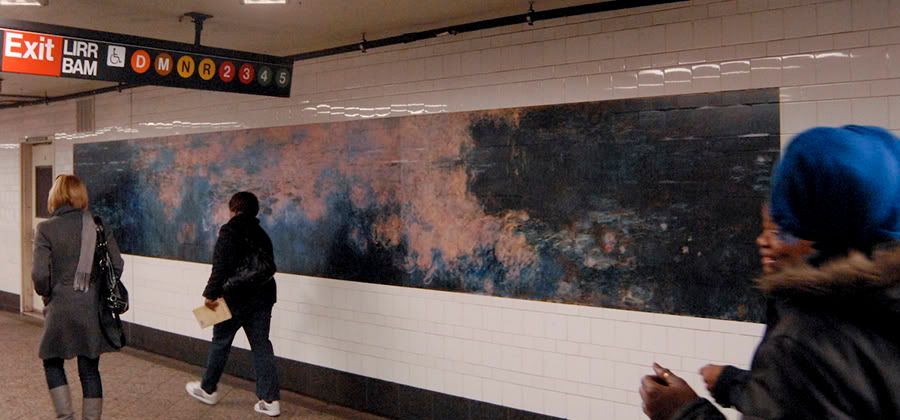
Here's another reason why I should be living in New York.
As a gift to the city’s subway riders, MoMA takes over Brooklyn’s Atlantic Avenue/Pacific Street subway station, filling the station with reproductions of over 50 works of art in the MoMA collection. 24 hours a day, 7 days a week, walk through the station to see images of works by Pablo Picasso, Vincent van Gogh, Charles Eames, Cindy Sherman, Andy Warhol, and many other great artists, filmmakers, and designers. It’s a beautiful reminder that the real MoMA is only a short ride away. See the rest of the "exhibit" here.
Via Swissmiss.
60 YEARS OF SOLES AND STRIPES
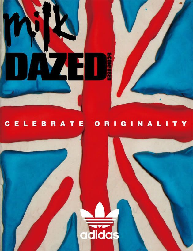
Two of the dopest magazines out there, Hong Kong's Milk Magazine and Britain's Dazed & Confused join forces for a wicked collaboration celebrating the 60th anniversary of Adidas Originals. The special anniversary package includes new artwork and photography that depicts Adidas' evolution over the different eras.
Via Hypebeast
UNITED STATES OF TARA
I don’t watch much TV (if at all) so this is the first time I’ve heard of Showtime’s United States of Tara. The show stars Toni Collette as a single mother (Tara) living with a multiple personality disorder. Having never seen an episode, I can't say much about the show itself, but what I can say is that director Jamie Carili has crafted a paper cut-out masterpiece for the opening titles, this guy can do no wrong. A follow up to his renowned commercial work for United Airlines, Carili uses cut-out illustrations by Alex Juhasz to create the sequence's charming pop-up book look. Check it.
Via Motionographer.
VISVIM NOMAD DADO 2.5l PACLITE
WALKING ON THE BOULEVARD OF TOMMOROW

THINK SILLY recently launched their latest feature entitled Walking on the Boulevard of Tomorrow. The piece catches up with some of the industries more respected head honchos and designers, getting their take on 2008’s most memorable events. Included personalities include: Jun Takahashi, Nigo, Tet from WTAPS, Eric Elms, and Masaya Kuroki amongst others. It can be viewed in its entirety here.
I'm a little surprised Hiroshi Fujiwara isn't on here, I thought 2008 was a great year for his Uniform Experiment collaboration; otherwise, this is a solid read. Also, take note you AF1-wearers, Mr.Takahashi shows us all how to rock them proper, well done sir.
Via Hypebeast.
ALEX PARDEE x WATCHMEN
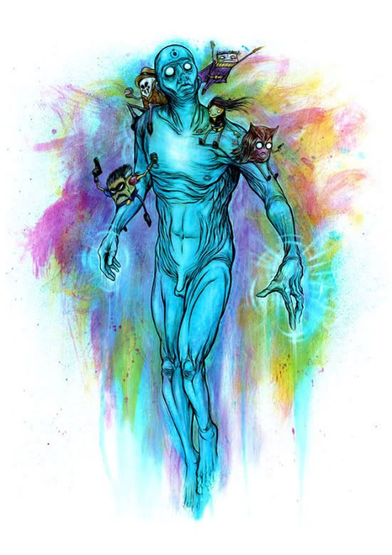
Apologies for adding to the already ridiculous amounts of Watchmen hype, but this is pretty awesome. Illustrator Alex Pardee recently did this piece of Watchmen-inspired fan art that debuted at the weekend's New York Comicon (ending today).
Via Josh Spear.
FUTURE TRENDS IN MARKETING
The Leo Burnett group recently posted their predictions for marketing trends in the new year. I'd say they're pretty much spot on (but what do I know right?). Then again, it's almost impossible not to be considering how much of a no brainer this shit is given our current circumstances. On a side note, there's some nice use of type and motion graphics here though I could have done without Ben's talking head.
Via Ispycool
BJORN BORG HELPS YOU BREAK UP
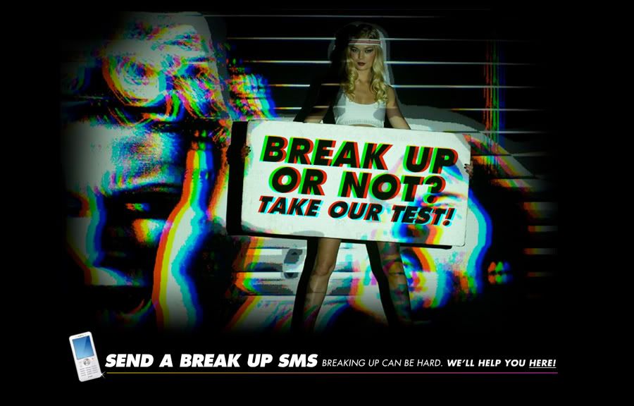
A new and amusing online campaign by Swedish underwear brand Björn Borg. The concept is all about breaking up in the name of love and then starting the hunt for a new partner. Bjorn Borg knows how hard it is to finish a relationship, so he starts by offering us a service to help us sendind the SMS message which will change our lives. But first of all, you have to take the test to understand whether you should break up or not with your partner. If the result is positive, you will immediately find a mobile phone (and some inspirational words) to dump your partner. Once you've sent the break-up sms to your current partner, make sure to continue the online experience clicking on "Find your next love here". The best as yet to come!
An outrageous concept by any means but you've got to hand it to the boys over at Farfar, they pulled this campaign off with undeniable wit and humor couple with some great design. You just can't help but smile, even when it's at the thought of dumping your partner.
Via Adverblog
SWAGGER LIKE US
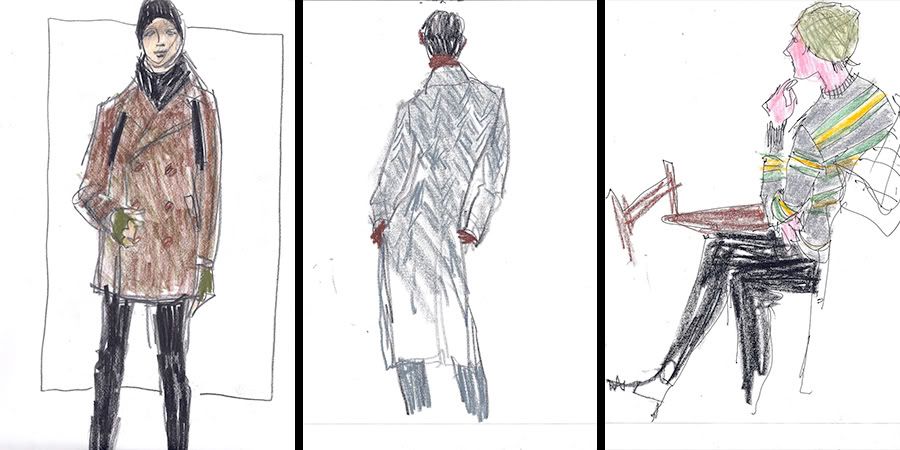
Compiled from What I Saw Today
ART HISTORY ONLINE
Smarthistory is a fantastic substitute for that art history class you never took in college.
smARThistory.org is a free multi-media web-book designed as a dynamic enhancement (or even substitute) for the traditional and static art history textbook. Dr. Beth Harris and Dr. Steven Zucker began smARThistory in 2005 by creating a blog featuring free audio guides in the form of podcasts for use in The Museum of Modern Art and the Metropolitan Museum of Art. Soon after, we embedded the audio files in our online survey courses. The response from our students was so positive that we decided to create a multi-media survey of art history web-book. We created audios and videos about works of art found in standard art history survey texts, organized the files stylistically and chronologically, and added text and still images. We are interested in delivering the narratives of art history using the read-write web's interactivity and capacity for authoring and remixing.
This thing is packed to the brim with content and it manages this with a clean interface that's easily navigateable, not an easy task by any means.
Via Kottke
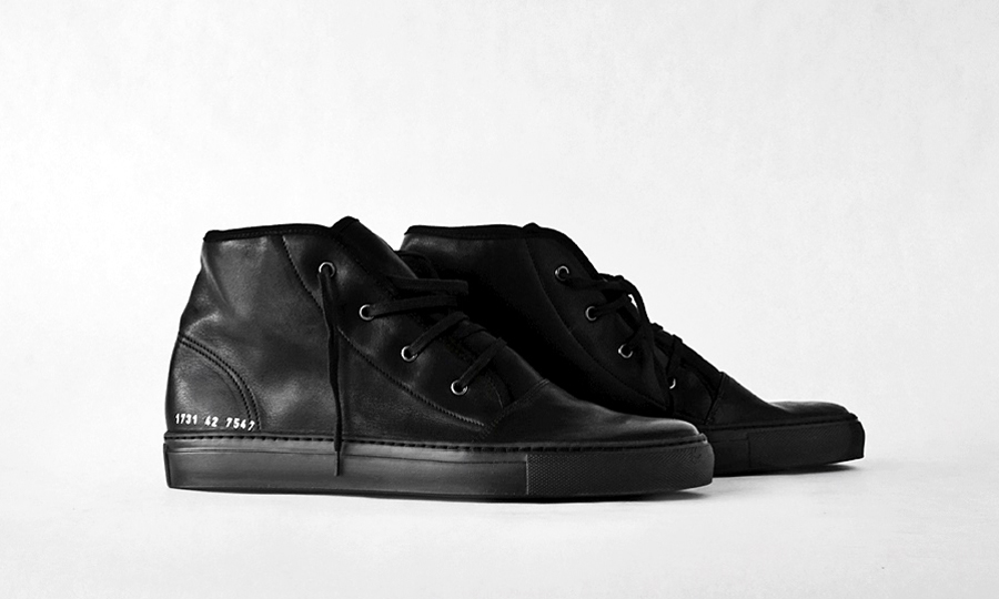
COMMON PROJECTS S/S 2009
LEVI VAN VELUW
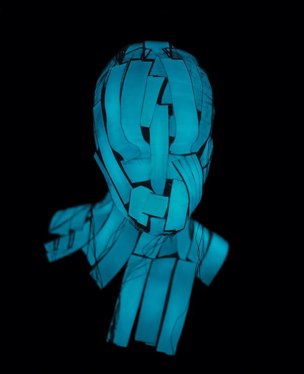
Dutch conceptual artist Levi van Veluw has recently revealed two new installation projects (if you could call them that), "Light" and "Natural Transfers". Expanding on his previous work, Levi continues to explore the mingling of the physical and non-physical on the most personal of mediums, his own face.
With “Natural Transfers” he shifts from covering how own face with materials pulled from the Earth (straw, stone) to a material from the human body: hair. Fluid and serpentine, the hair, though growing from the crown of the head, becomes a mask, almost an invasion. Hair that wishes it could become skin.
With “Light” he moves the image into an entirely new entity all together. Trading tangible, physical entities for the geometric possibilities of light-emitting foil, photographed in blackness, as it glows and takes form across the invisible blackness of his now unseen face. As van Veluw explains on his site: “Light becomes form and it stands free from any ‘original’ subject. It is this ‘invisibility’ of the production processes that creates the freedom in this image."
Via Shape+Colour
CHRIS CUNNINGHAM SHOOTS GRACE JONES
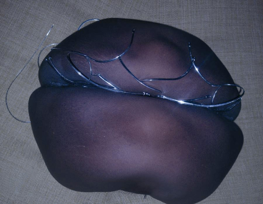
Late news but news nonetheless (for me anyway). Chris Cunningham shoots Grace Jones for the November 2008 issue of Dazed & Confused. Seriously, only goodness could come from such a collaboration. The Rubber Johnny-esque shots of Grace (sans Chris' scrotum thank god) are quite clever and it's great to see Chris still doing his thing. I'll definitely be picking up a back issue.
See the rest of the photographs here.
THE RUMPUS INTERVIEWS RON ENGLISH
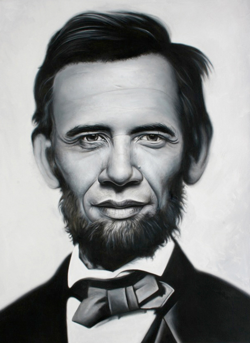
Great interview with artist Ron English up on The Rumpus.
Well, I live a weird life because I do live in a bubble even though I go all over the world. Everywhere I go, I’m still in a bubble. I think a lot of politicians, that happens to them. That happened to George Bush. Everywhere he went they put him in a stadium full of people cheering him on, when that only constituted a very small percentage of the world’s population in what they thought. But it would be easy for him to think, ‘Everybody agrees with me.’ ... And I think you want to make a conscious effort to make sure that, you know, the day that you don’t have any Republican friends, or you don’t have any Christian friends, or you don’t have any Muslim friends, that you only have, like, artists-from-New-York-City friends, then I think you have a problem.
Check it.
TED 2009
Wicked opening sequence by Trollbäck+Company for TED 2009. Mad respect to Sacred Noise for the amazing sound design... Also, judging from this year's speaker line-up, the conference is sure to be a memorable one. Can't wait to see it all on youtube.
Via Motionographer.
GREENPEACE DESIGN AWARDS 2009

Greenpeace Australia Pacific is hosting a new design award. The aim is to motivate the global creative community to develop visually striking artwork that encourages the public to support Greenpeace and take action on critical environmental issues.
The brief is to design a poster that delivers the message ‘Be a Part of the Action’ – this does not necessarily have to be expressed in words. The poster could bear witness to catastrophic environmental damage and in doing so, cause outrage. Alternatively the poster could actively encourage peaceful protest to expose an environmental problem. Above all, the poster needs to raise awareness of environmental issues and inspire action.
I'd love to take part in this, especially after being inspired by the work over at Designers Against Human Rights Abuses. I just hope I can set aside some time over the following months... if only I had known about this earlier.
Via Osocio
TRANSFORMERS 2

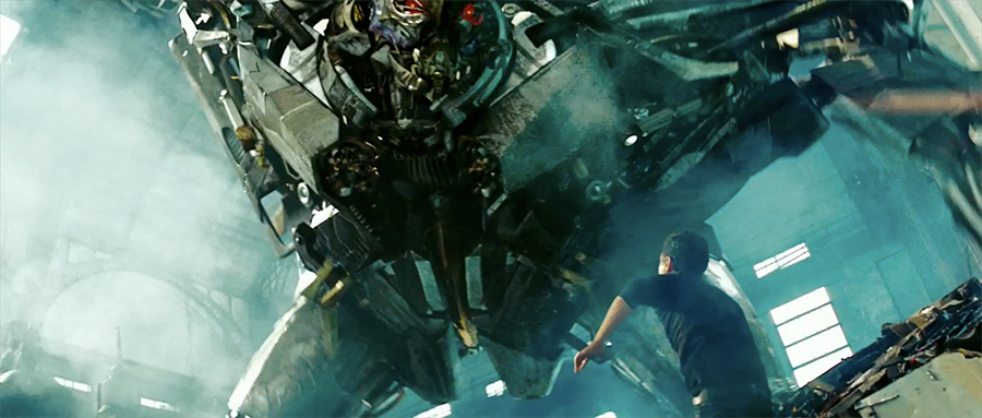
I blew my load when I saw this. I can't believe they've revealed both Devestator AND Ravage in the teaser. Fuck the G1 fan boys, this shit is crazy! Feel free to disagree but Transformers looks like it will kill G.I. Joe and (possibly) Star Trek. Peep the HD teaser here.
THE INAUGURATION. AT LAST.
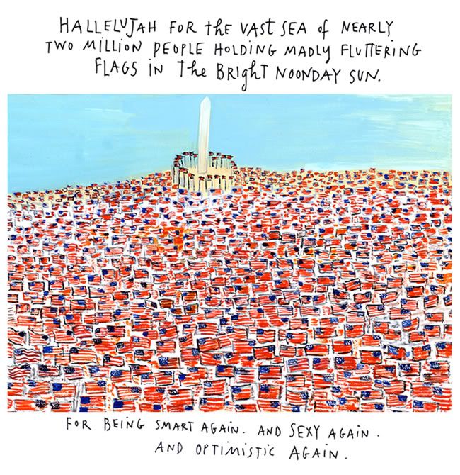
Maira Kalman, blogger for the New York Times, begins a new series of columns about American democracy with an illustrated chronicle of her visit to Washington.
Check it.
FORGET ALL THE RULES

Forget All The Rules You Ever Learned About Graphic Design by Bob Gill. Pick up a copy here.
Via Swissmiss.
BANNED CALVIN KLEIN AD
Another banned Calvin Klein commercial shot by Stephen Miesel. Also, the boobage on Edita Vilkeviciute is pretty amazing. Check it.
Via Frillr.
NETDIVER'S BEST OF 2008
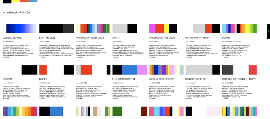
Netdiver is an online magazine that covers, reviews and publishes outstanding work by the international design community. Their Best of The Year issue lists the top 100 projects and talents that have made a strong and lasting impression over the previous year. It's a great go-to list if you're looking to refresh your memory and (re)discover new sources of inspiration.
My favorite entries were for art director Sato Kashiwa (pictured above), illustrator Cristian Turdera and the design collective L2M3. Be sure to check out their work.
Via Fontfeed.
BOOK COVERS
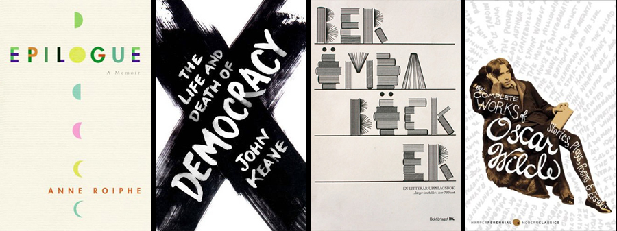
Some recently posted book covers I thought were pretty dope.
Compiled from Covers.FWIS and The Book Cover Archive.


